
The Name Is Simple. Atlanta City FC’s Identity Isn’t.

Atlanta City FC's new crest works at first glance. The longer you look, the more it has to say.
Kacey Covino has looked at the Atlanta City FC crest more times than just about anyone alive. She saw it as a sketch. She saw it as one of 20 or 30 concepts fighting for space. By her own count, she saw "the thousand drafts that led to the final draft."

And early on, she saw the one she wasn't going to let go of.
"When I saw the 'A' in the bird," Covino said. "Deep in my gut, I was like, I'm going to fight for that one."
Turns out she didn't have to fight very hard.
"It was just a very collective response to that one," she said. "It just kept coming forward."
On Monday, AMB Sports and Entertainment finally let the rest of us see it. Atlanta's National Women's Soccer League club is Atlanta City FC, and it starts play in 2028. The crest is a phoenix with an A hidden in its form, surrounded by a dogwood blossom and grounded by roots. The colors are Atlanta Red, Georgia Peach, Platinum Metallic and Black Char.
That's the what.
SDH spoke with the people who built it to get the how and the why. What came out of those conversations was a brand that started with a question most brands skip. Not what should this look like, but what should it feel like?
A brand launch is always going to produce instant reactions. Nobody needs permission to like or dislike a name, a crest or a color palette. But reaction and explanation are different things. After spending time with the people who built Atlanta City's identity, what interested me wasn't whether everybody would agree with their choices.
It was understanding what those choices actually were.
Don't Just Throw a Bird on It
Covino, Atlanta United's director of business operations, grew up in this soccer community. She played club, mostly at UFA, and then played a couple of years at Georgia College. Getting to help build this was, in her words, a "dream come true."
It wasn't a glamorous build. The club was working with Nike against production deadlines, and once the work started, it had to move fast.
"We had no dedicated staff," Covino said. "So it was a lot of hand-raisers, people that were excited to be a part of it."
It would've been easy to rush it. Instead, the club went out and asked.
Soccer supporters in Atlanta, NWSL Atlanta Founding Member deposit holders, AMBSE associates and local leaders all weighed in. Some of the questions were the ones you'd expect. What imagery resonates? What names do you like?
The ones Covino cared about most were harder to answer.
"What do you want to feel when you look at the club? What values do you want us to talk about every day on social?" she said. "I think it's much easier to try to build things to make people feel excited or feel compelled or feel interested, versus just being like, 'Y'all should throw a bird on it and call it a day.'"
They did put a bird on it, as it happens.
They just didn't call it a day.
AMBSE creative director Larry Luk and associate creative director Tucker Brooks worked out of a group Luk calls "small but mighty, six to eight people in our own creative room." They put in what he called "moonlight hours." And they started the old way, with pencils.
"That was weeks of just sketching and talking," Luk said. "There are so many pieces of scratch paper that we drew on that we still have."
Brooks said they went through hundreds of sketches. Luk said every curve, every line and every color choice came out of a collective process involving multiple creative minds.
That's worth remembering when looking at any finished design. Simplicity can look obvious after somebody has done all the work required to make it feel obvious. The discarded ideas disappear. The sketches disappear. The argument over one curve instead of another disappears.
All you're left with is the mark.
The Bird
The phoenix was never really in question. It's been Atlanta's symbol of rising and rebuilding for generations.
What was in question was how it would show up.
"We knew there'd be a phoenix somewhere in the mark," Brooks said. "We just didn't know how that was going to come to life and how it was going to represent itself. Is it the name? Is it the icon? Is it a character?"
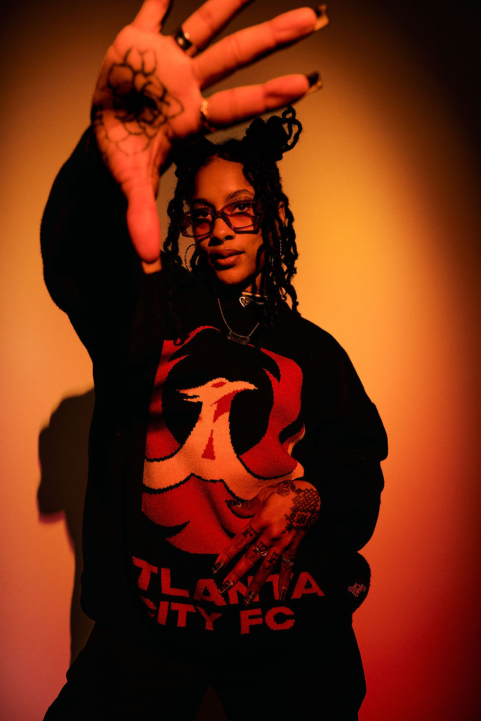
Hundreds of sketches later, the answer was a bird that carries the city's initial inside its own shape.
It's subtle. It's also impossible to unsee once you've found it, which is exactly the balance Covino was after: "subtle but also at the forefront."
The A was one of the first things that jumped out at me. The phoenix is such an established piece of Atlanta imagery that it was always going to draw most of the attention, and the A gives it an immediate connection to the city.
You know whose crest this is before you've read a word.
Deandra Duggans, the club's vice president and chief business officer, calls the phoenix her favorite part. She wants people to look past the silhouette, though.
"You get down to the textures, and you see the texture and the feathers and the roots and the tail, and it means something," she said. "If you know the story of Atlanta, the city burned down and it rose from the ashes, and the city continues to rebuild, continues to rejuvenate. That is all important for this club."
Beautiful and Built to Last
The phoenix is the headline. The dogwood is the part I keep coming back to. Brooks explained why it's there simply enough.
"When you think Washington, D.C., you think cherry blossoms. You think Atlanta, you think Dogwood Festival," he said.
So the dogwood had to be in the mark. The only question was how loud it should be, and the room landed on quiet.
"It's there, but it's subtle," Brooks said. "You don't really see it. It actually worked out really well."
That hierarchy matters. There's a lot embedded in the crest, but it isn't all competing at the same volume. The phoenix works first. The A reveals itself next. The dogwood is quieter still.
Whether somebody likes the finished mark is personal taste. The layering isn't accidental.
For Covino, the flower is the whole crest in miniature.
"The flower is elegant. It's feminine. It's beautiful," she said. "And at the same time, it's a tree that can endure hardship and survive really hot summers and really cold winters. So you have this duality: yes, it's beautiful and it's feminine, but it's also badass and it's powerful."
That idea works so well for me.
The phoenix tells the Atlanta story we all know, the one about resilience and rising again. The dogwood tells a slightly different one. Beauty and toughness. Roots and growth. Something that feels specifically connected to Georgia.
It also makes an interesting argument about what strength has to look like.
Strength here isn't communicated by making every line sharper, harder or more aggressive. The dogwood makes almost the opposite case: beauty and toughness don't cancel each other out. Femininity and power aren't competing ideas.
Kiana Miree, AMBSE's vice president of retail and merchandising, saw the same tension in the color palette.
"When I saw the colors, I was like, this is brilliant," she said. "Because without trying too hard, it is feminine, but it's also confident. It's bold."
Covino knows what missing that balance would've looked like, too.
"It doesn't feel too feminine, too girly," she said. "It also doesn't feel masculine or too close to Atlanta United. So I think we hit it right on the mark."
Two Hundred Names
Covino said the group looked at "100, 200-plus names" before settling on one that had been sitting on an early list the whole time.
The problem was obvious from the start.
"We knew we wanted to channel Atlanta's soul, but there are so many lenses of our culture," she said. "How do you talk about all of that with just one name?"
The answer was to stop trying.
Put the city in the name and let the city carry it.
"Atlanta was the most important thing," Covino said. "We looked at other stuff, but ultimately we kept coming back to: we need Atlanta front and center."
Duggans saw it the same way.
"Atlanta is original," she said. "It was very important to have Atlanta be a part of the name. It was very important to have that 'A' be a part of the brand identity, because people love Atlanta. People from here love the city, and there's a lot of passion and pride that goes into that."
I understood Atlanta City pretty quickly, but the name made even more sense to me once I saw it as part of the complete identity.
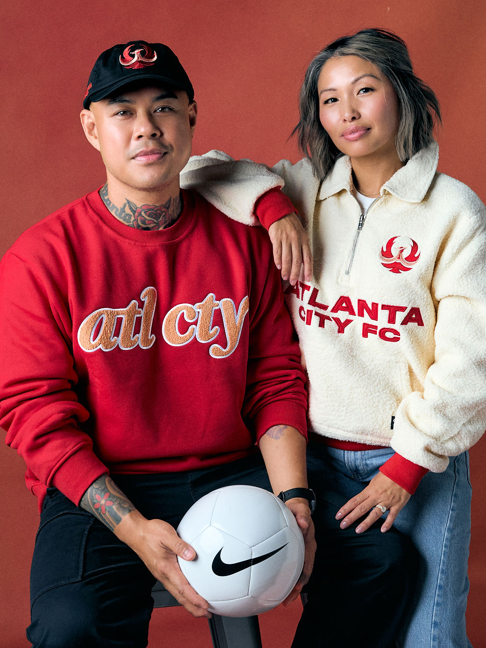
The name isn't being asked to carry every piece of Atlanta by itself.
The phoenix does some of that work. The dogwood does some of it. The colors do some of it. Future kits will do some of it. Players, supporters, neighborhoods, matches and moments will eventually do a lot more.
That's important because Atlanta gets harder to represent, not easier, when you narrow it down to one clever reference.
There are plenty of names that could evoke one chapter of Atlanta history, one nickname, one landmark, one piece of local culture or one particular community. Some might sound more unusual on first hearing.
But specificity comes with a tradeoff.
Pick one piece of Atlanta and you inevitably elevate it above the others.
Atlanta City does almost the opposite. The name stays broad and lets the identity around it tell the more specific stories.
That's not necessarily the trendier choice.
I'm not sure that's the goal.
No Ceiling
Arthur Blank has been clear about the scale he sees for this club.
Speaking at Sports Business Journal's Business of Soccer conference in March, Blank traced his approach to the same decision AMBSE made when Atlanta United launched. At the time, conventional MLS thinking leaned toward smaller soccer-specific stadiums. Blank wanted room to find out how high Atlanta's ceiling actually was.
Atlanta United eventually drew crowds of more than 70,000.
When Blank approached NWSL Commissioner Jessica Berman about the women's team, he said he brought much the same philosophy with him.
Mercedes-Benz Stadium, he said, could be a world-class facility for women just as it is for men.
"I didn't wanna put limits on attendance," Blank said. "I hate putting limits on anything in that regard."
The new women's training facility is being built with the same language in mind: world-class and first-class "in every single way."
Blank also talked that day about where he thinks American soccer still has to go.
The goal, he said, is reaching the point where soccer becomes "the table conversation" — something talked about around the kitchen table in the same way the NFL already is. He specifically emphasized the importance of women's soccer connecting with children and families.
Seen through that lens, Atlanta City makes even more sense to me.
This isn't being built as a boutique women's soccer property for people who already know the league. The ambition is much larger than that.
For me, having Atlanta in the name was close to a necessity.
If you're trying to make this one of Atlanta's major sports teams, the person who doesn't follow the NWSL yet matters. The casual sports fan matters. The family deciding what to do on a Saturday matters. The girl seeing this club for the first time matters.
You shouldn't need to understand an inside reference before you know whose team it is.
Atlanta is right on the front door.
That doesn't mean the existing women's soccer audience matters less. Blank spent another part of that same conversation emphasizing listening to fans, something he traces back to Home Depot and describes as central to all of his businesses.
But listening to the existing audience and placing a ceiling around that audience are two different things.
Women's soccer gets bigger by bringing more people inside.
And Blank is explicit that he views that growth as a real business, not a philanthropic side project. Community involvement matters enormously, he said, but so do value creation, profitability and long-term sustainability.
"It's not a hobby," Blank said.
For women's sports, that's an important distinction. Sustainable investment means more attention, more jobs, more infrastructure and more opportunities for women and girls across the sport.
The ambition isn't to own a women's soccer team.
It's to build a big one.
Same Family, Different House
That ambition doesn't mean making Atlanta City look like Atlanta United with different colors.
The parallel is deliberate.
So is the distance.
Atlanta City lives in the same AMBSE house as the Falcons, Mercedes-Benz Stadium and Atlanta United. It didn't want to look like a younger sibling in borrowed clothes.
Mauricio Culebro, AMBSE's president of soccer, put it plainly.
"I think the thing that I like most is that it's very different from the Atlanta United one," he said. "But at the same time, you can tell that it's part of the same group."
The connective tissue is small on purpose.
Covino pointed to a chevron pattern borrowed from the men's side, and said it "doesn't even come to life on every single execution. It's really the more premium executions."
The biggest difference is the palette, and it was the biggest surprise for me.
If you'd told me Atlanta Red, Georgia Peach, Platinum Metallic and Black Char ahead of time, I wouldn't have imagined them pairing well.
On the finished crest, they really work.
It's distinctive without losing the thread back to Atlanta.
Culebro singled out the colors, too.
"When you see the logo compared with the other logos, you can see that the logo stands out," he said. "It looks more energetic, more innovative."
Miree had the same reaction the first time she saw them.
"I was like, this is brilliant," she said. "Because without trying too hard, it is feminine, but it's also confident. It's bold. It's everything we promised it would be in words."
Who Was in the Room
Duggans didn't start until April 15, late in the process.
She came from the Las Vegas Aces, where she spent about four years in marketing and brand leadership while the franchise became one of the signature brands in women's professional sports.
Covino remembers her first day.
"I was like, we have to sit in this room and you have to see where we're at, because it's almost done," Covino said. "And she came in and brought a few things that really just took it [to another level]. So she made an impact on day one."
Covino's been with Atlanta United since 2016, and she's honest about what that does to a person's instincts.
"It's very hard to break out of the cycle of what we've been doing," she said.
Duggans brought a different lens.
"Women's sports fans are very loyal, and they want to make sure that they belong to something," Duggans said. "But that something can't just be anything. It has to be meaningful. It has to be impactful and purposeful."
The creative room worked the same way.
Luk said they didn't make decisions without bringing in "the women on our team or our partners across the organization, to check us."
Miree started somewhere even closer to home.
Her own closet.
"What are the silhouettes that would align to the pieces already in my wardrobe?" she said. "How are women dressing today, and how do we ensure that our merch is a reflection of those moments?"

The goal wasn't simply to make women's versions of traditional team merchandise. It was to create apparel that could live outside the stadium, too — at coffee, brunch or wherever else someone wanted to wear it.
That part matters because the identity wasn't conceived as a crest sitting by itself on a press release.
It was designed to live.
And it was designed by actual people making actual choices.
None of that requires anyone to like the result. Design is subjective. Someone can want a more aggressive crest, a more adventurous name or an entirely different visual approach. But disliking the result isn't the same thing as establishing that nobody thought about it.
After sitting with the people who made it, that distinction feels important.
Layers
Fans get their first real look on Sunday, Oct. 4, at a launch celebration from noon to 4 p.m. at the Southern Exchange Ballrooms, 200 Peachtree Street.
The first merchandise goes on sale there, and Miree is already counting the votes.
"Your vote, spending your next paycheck on NWSL merch, is a win," she said.
The crest is only the first chapter.
Luk knows it.
"Every team drops multiple kits every season, and every kit has some kind of unique story to it," he said. "So this is just a jumping-off point for the infinite storytelling we can do with the club."
That might be what I like most about the whole thing.
Some of it works immediately. The A in the bird hits you the first time you see it. The colors win you over about a second later.
Other parts reveal themselves more slowly.
The dogwood.
The roots.
The connection between the simplicity of the name and the layers surrounding it.
That's why I don't think the name has to provide all of the personality by itself.
Trends change. References age. The thing that feels impossibly clever in 2026 might feel very different in 2046.
Atlanta City leaves room.
Room for different parts of Atlanta to find themselves in it. Room for the club to change how it tells those stories. Room for kits and merchandise and supporters and players to add things nobody sitting in a creative room today could possibly predict.
And eventually, if this works, the name won't need explaining at all.
It will mean whatever happens while Atlanta is wearing it.
Luk's team still has a lot of that scratch paper.
Weeks of sketching. Hundreds of ideas.
One bird with a letter hidden inside it.
The club won't play its first match until 2028.
It already has a lot of stories to start telling.


Comments